Designing engaging user interfaces (UIs) for software applications is a challenge to be acknowledged in the modern IT world. Regardless of platform type, the importance of attractive UI’s is arguably as critical as the functionality itself. That, because a buggy, unattractive, and confusing interface can render an application unusable or, at least, suboptimally usable, as it creates frustrating user experiences that can significantly impact enjoyment and productivity.
The concepts proposed in this article are predicated on the notion that the primary function of a user interface is to maintain a dialog with the user. With the goal of optimizing user experience and based on UI design best practices, the 4C framework defines that user interfaces must have:
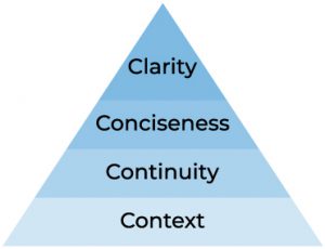
The framework focuses on cleanliness and user engagement in the two layers of UI communication: human language and design language. Each item serves as the foundational basis for the next level, ultimately aiming for clean and intelligent designs.
Context
The base of the framework defines that systems must speak the language of the context they inhabit. Therefore, ensuring the application’s vocabulary matches the one utilized in its business environment is paramount. In addition, it is easier to establish rapport with users when they notice the app speaks the same language they do. Not only that, but ubiquitous terminology also reduces the learning curve required to use the software, making it easier for users to transition to the new system. Moreover, language and tone have to converge to communicate in a way that resonates with the target audience. For example, academic language would not be ideal in an e-commerce app that sells video games.
The design language aspect of this principle is equally important for several reasons. Firstly, UI layouts must align in style with the context in which it is presented and be user-centric. For example, the use of flashy, colorful visuals can be desired in a children education app, but undesired in a medical platform. Secondly, the social context of the application must also be considered. Ideally, layouts should be welcoming to diverse audience groups. For instance, accessibility features can be essential to those with special needs, enabling them to use the system and minimizing further challenges.
Continuity
In the layer of human language, this item is about keeping the user constantly in the loop and providing closure to their actions. For example, when the user attempts to add a product to his or her shopping cart, a better user experience is achieved if the UI sends a response, signalling that the addition was successful. Furthermore, it minimizes user errors by preventing duplicate items from being added to the cart.
Moreover, this is one of the most critical guidelines in design language. When developing systems that offer multiple screens, there must be a constant factor that ensures a sense of continuity across the entire application. The key is to standardize screen layouts, ensuring no discrepancies or radical differences are perceived as the user navigates to another screen or page. Not only will this increase the sense of familiarity, making users more comfortable when using the software, but it is also a display of consistency and attention to detail.
Conciseness
System dialogs must be brief. Long, exhaustive texts in user interfaces tend to bore and distract users, as most people will likely just rapidly skim through them carelessly. Instead, the focus should be on short, precise messages that can ideally be read in two seconds or less.
UI layouts must also be concise. The idea is to minimize the cognitive load by reducing the number of displayed components, allowing the user to focus on what is critical in achieving the intended goals. For example, exaggerated colors or unnecessary graphics must be avoided in favor of more minimalistic and straightforward designs.
Clarity
With the strong basis enabled by its predecessors, the final block defines that UI’s must be clear. On the first layer of UI communication, human language, this principle speaks to the clarity required in all written or spoken language presented during user interaction. All messages directed to people using the system must be informative, clear, and leave no room for ambiguity. In other words, room for interpretation should be minimal, and all dialog must be explicit and precise.
On the second layer of UI communication, design language, the focus is on the visual metaphors utilized to convey meaning. For example, it is good to use symbols that help communicate application status, such as an exclamation mark icon preceding error messages. In addition, the use of colors to emphasize purpose is vital, such as red for error messages or green for success notifications.
In conclusion
I authored the 4C framework to simplify the development of effective user interfaces based on my work experience as a software engineer. The framework can be used in conjunction with other principles vastly applied and proved in the discipline of information systems design. When it comes to UX, the feelings lived by users as they navigate the application can be either centered on enjoyment or stress, and are critical to defining whether a system thrives or fails. Focusing on what is relevant and discarding the unnecessary is the key to designing applications that deliver tangible value to users and the business they serve.
About the Author

Luiz Parente is a senior software engineer who is passionate about systems design and technology. Having started his journey in computer programming at the age of 14, his core expertise is centered in solutions architecture with .NET technologies.
Follow Luiz on LinkedIn